
In 2023, Titan Robotics updated its brand. We are now known as TC Titans FRC Team 3767 or simply, TC Titans.
ABOUT OUR LOGO
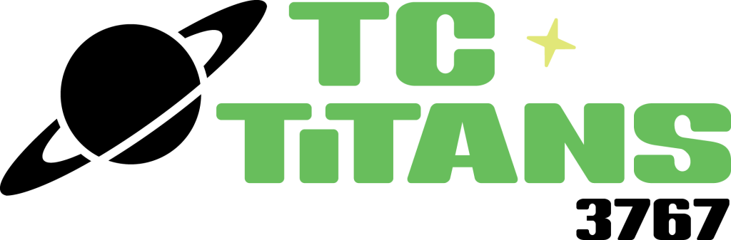
The TC Titans are rooted in our Traverse City community, but our logo is inspired by the world beyond our current surroundings. Titan is the name of the largest moon orbiting Saturn, thus, our logo symbolizes the possibilities of reaching beyond our limits. In its representation of space and the advancements achieved by careers in STEM – Science, Technology, Engineering & Math – it inspires us to never stop exploring different outcomes and reminds us that we have much to gain when we remove boundaries and work together. Like the many moons orbiting Saturn, we are part of the FIRST Robotics community and are charged with inspiring interest in the disciplines of STEM, particularly in future generations. Guided by the FIRST principles of Gracious Professionalism and Coopertition, we look at ourselves not as a lone team, but as part of a planetary system where we are balanced in a perfect orbit around each other. The TC Titans logo embodies the seven characteristics of being a TC Titan – quality, resilient, professional, spirited, intentional, inspiring and collaborative.
WHY?
In the world of FIRST Robotics, the most memorable teams are known not only by their strong performance on the competition field, but by a clever name that they’ve then successfully branded. Exploding Bacon. Space Cookies. The Holy Cows. Mechanical Bulls. Killer Bees. Cheesy Poofs. It is not as common for FIRST teams to align with their high school mascot.
In its 13 years of existence, the TC West Robotics Team has been known primarily as the Titans, which is our school mascot. The problem we encounter with this name is, there are at least a dozen other Titans competing in FIRST, not to mention Titan spin offs such as the Techno Titans. Competing alongside other Titans has been cause for confusion at local, state and national events in the past.
To add to that confusion, in those same 13 years, we have had at least six different logos and inconsistent use of team colors and overall branding. We found ourselves asking the question, “How can we be memorable to other teams when we don’t even know who we are?”
WHAT’S IN A NAME?
In the summer of 2023, our Business Team was given the go ahead from our Leadership Team to pursue a refresh of our brand. The first stop was our name. While our team name, Titans, was unoriginal, the team felt that we had built some equity into it, particularly after our highly successful 2023 season. We also felt it was important to be true to our school and the community that supports us, and so it was agreed upon that we could not abandon the Titan name. That is when the name “TC Titans” was suggested. As we tossed it around, it didn’t take long to realize that it checked all the boxes: it kept us aligned with our school and the Traverse City community while giving us a little individuality.
IDENTIFYING OUR TEAM CHARACTERISTICS
Next was the logo. But before we could figure out how it might look, we asked ourselves two important questions: (1) When people think of our team, what is their perception of us? and (2), What do we aspire to be? In other words, what is our brand? We proceeded to produce a list of adjectives that we felt describe us and then narrowed it down to what we feel are the top seven defining characteristics of a TC Titan: Quality, Resilient, Professional, Spirited, Intentional, Inspiring and Collaborative.
THE NEW LOGO
Then came the logo refresh. We knew in order to match the quality of the robot that we’ve been turning out and its performance on the field, our logo needed to be more professional and consistent.
FIRST teams are meant to run their team like a business. We knew that it was time to seek some professional help so, like any good business should do, we turned to the experts to help us elevate our team mark to the level of our robot performance.
Enter the team at Greenlight Marketing in Traverse City, Michigan. Greenlight Marketing donated their time and mentored us through the rebranding process, educating us on what makes for a good logo and what part it plays in a company or organization’s overall brand.
They picked our brain and let us pick theirs, and challenged us to think outside the box. They asked us questions about our Vision and Mission as a team, and helped us sort through the sea of team logos out there to help us come up with something uniquely ours. It is through their creative expertise and guidance that our new logo was born.

You must be logged in to post a comment.